
Are you looking for examples of Analytical Paragraph for Class 10, no worries, you’ve come to the right place! Our post provides 10 Analytical Paragraph samples based on previous years’ exam question papers. These examples of Analytical Paragraph can help you understand the format, tone, and language used in such paragraphs. We offer detailed explanations for each sample and highlight the important features that make it effective. You can use these examples of Analytical Paragraph as a reference to write your own letters or as a guide to improve your writing skills. So, check out our blog post and learn all about the examples of Analytical Paragraph for Class 10!
Here we go….
Analytical Paragraph 10 Examples based on previous question papers
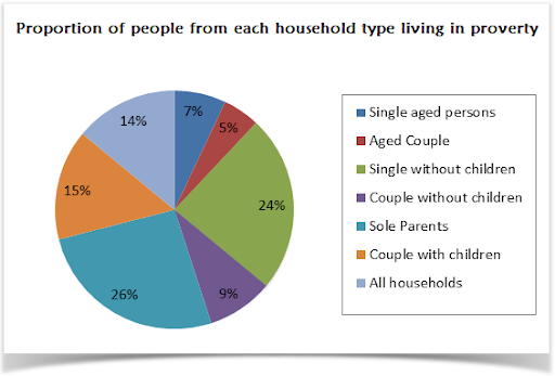
Q1. The pie chart shows the proportion of people from different households living in poverty in the UK in 2002. Write an analytical paragraph to describe the information in 100-120 words.
Answer:
The given pie chart illustrates seven different categories of households living in poverty in the UK in 2002.
It is clearly evident from the pie chart that 26% of the total poverty-stricken households are those of sole parents. Single people without children account for the second highest proportion with 24%. In contrast to couples without children that accounts for just 9%, couples with children account for 15% of the poor households. Single aged persons and aged couples proportion for 12% together for poor households.
Overall, 14% of all households in the UK were living under poverty. The younger generation had a greater poor percentage than their aged counterparts. Couples without children had better economic conditions than those with children.
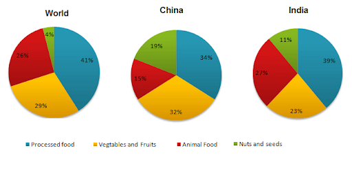
Q2. Below given are three pie charts showing consumption habits of India, China and World overall in 2008. Write an analytical paragraph describing the pie charts (100-120 words).
Answer:
The three given pie charts depicts types of food consumption in 2008 as compared in two countries- India and China. In general, processed food is the major type of food eaten.
Processed food comprises as high as 41% of the global consumption. In China and India as well, processed foods are consumed the most, the rate of consumption being 34% and 39% respectively. On an average, vegetables and fruits constitute 29% of consumption. In China, vegetables and fruits comprise 32% of food consumption which is 9% more than that of India. For Indians, animal food accounts for 27% of their diet, exceeding Chinese food consumption by a striking 12%. However, nuts and seeds comprise almost one-fifth of Chinese food habits. This is way more than the global consumption of 4% and 11% of India.
Overall, world food consumption largely comprises processed food. Chinese consumption of nuts and seeds is unbelievably higher than the average percentage.
Q3. The following table shows details about the internet activities for six categories for different age groups. Write an analytical paragraph for the table given in around 150-200 words.

Answer:
The given table suggests the internet activities of seven age groups ranging from teens to those in their seventies for six different kinds of activities. The table shows that the younger generation is more interested in online games and news, while the older generation spends time on the internet to research and buy products.
It is evident from the table that teens mainly use the internet for games (as high as 81%), news and downloads and are interested in searching for people or friends or doing any product research. The middle-age group (people in 20s to 60s) is highly interested in getting news, doing product research and buying products, the percentage ranging from 70-80%. The internet activity which gets the least time is searching for people. All the age groups spend less than 30% of their internet time on the same. The amount of time spent on downloads decreases with age and gets as low as 6% (for people in 70s).
Overall, the table suggests that teenagers are most likely to spend time playing games and doing downloads. On the other side, older people are interested in researching and buying products. People spend the least amount of time searching for other people online.
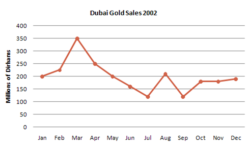
Q4. The graph given shows estimated sales of gold in Dubai in 2002. Write an analytical paragraph describing the line graph in around 150 words.
Answer:
The line graph depicts the estimated sales of gold in Dubai for a period of twelve months in 2002 in millions of Dirhams.
In January 2002, the sales stood at 200 million Dirhams. It steadily increased through the next month and peaked to 350 million Dirhams in the third month of the year. However, the gold sales started to plummet over the next three months and hit 110 million Dirhams in the month of July. Unexpectedly, the sales doubled in August before coming down to the same level as in July for the month of September. For the next two months of the year, the gold sales levelled off to 180 million Dirhams and then slightly increased in December.
Overall, the estimated gold sales fluctuated in 2002. The sales were the highest in the month of March and lowest in the months of July and September. The sales at the end of the year were almost the same as they were in the beginning of the year.
Here we conclude the topic of Analytical paragraphs. As it is a new topic added to the syllabus of Class 10, students need to prepare it well.
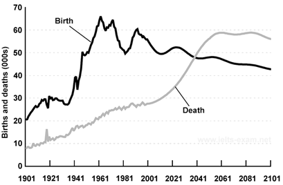
Q5. Below is a graph given showing birth and death rates in a country from 1901 to 2101. Write an analytical paragraph (100-150 words).
Answer:
The graph shows birth and death rates starting from 1901 till 2101.
Since 1901, the birth rate has remained more than the death rate until 2041. Birth rate was 20000 in 1901 and started increasing gradually. It peaked in 1961 to around 65000. From 1961, birth rate has fluctuated multiple times between 50000 and 60000. It is expected to decline for the coming years reaching approximately 42000 by 2101.
On the other hand, the death rate stood at around 10000 in 1901 and then has increased steadily. It is expected to rise strikingly from 2021 before levelling off to approximately 60000 between 2061 and 2081. The graph indicates a slight decline in deaths in the year 2101.
The graph shows the huge gap between birth rate and death during 1961 to 2001. However, this gap is expected to reduce in the later years. Overall, as opposed to the prevailing trends, the death rate will be more than the birth rate in the later half of the 21st century.
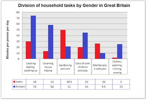
Q6. The chart shows the division of household tasks by gender in Great Britain. Write an analytical paragraph describing the chart given in not more than 200 words.
Answer:
The chart shows the number of minutes per day spent by British men and women in doing household tasks. On an average, the women spend about four hours doing household tasks whereas the men spend less than two and half hours.
The tasks on which women spend more time than men include cooking, cleaning house, taking care of the children and laundry. In doing all these tasks, women spend approximately 200 minutes which is almost three times the time spent by men in these tasks. On the other hand, men spend twice the time than women in doing tasks like gardening and maintenance of odd jobs in the house. Men spend the highest time, almost 50 minutes, in gardening and petcare. While the women spend only 30 minutes for these tasks. The time spent by men in washing, ironing and sewing clothes is as low as 2 minutes per day as opposed to 25 minutes spent by women.
In short, women spend far more time doing household chores than men whilst men prefer to do gardening, petcare and maintaining odd jobs.
Q7. You asked people what they thought was the most valuable thing. The given pie chart shows the analytics of the different answers you received. Write an analytical paragraph for a research project in 150-200 words.

Ans. The given pie chart displays the analytics of different answers to the question of what people thought was the most valuable thing in the world. The pie chart is divided into five sections, meaning that the total number of responses to this question were five.
The pie chart shows that the majority of people think Knowledge to be the most valuable thing to possess. Knowledge holds forty-eight percent of the pie chart, which indicates that almost half of the responses said that Knowledge is the most valuable thing. On the other hand, Power is the most valuable possession according to the minority of the respondents. Fame is almost on the same level as Power, only two percent more. Love and Money hold twenty and eighteen percent of the pie chart respectively.
In a nutshell, Knowledge is said to be the most valuable thing. Many people consider Love and Money to be almost equally important. Very few people give importance to Power and Fame.
Q8. A research was conducted in order to see the maturity gap between young people of 15-35 years old and older people of 36-60 years old. The respondents were asked which of the following was the most important in order to be successful in life. Conceptualise the given result in an analytical paragraph having 150-200 words.
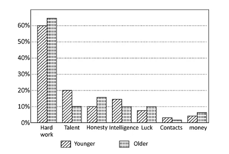
Ans. The given bar graph represents the research conducted to observe the difference in the mentality of young and old people.
The respondents were asked which of the following items was the most important in order to be successful in life. The respondents ranged from young people of 15-35 years old to older people of 36-60 years old. The bar graph is a grouped type bar graph, which shows the side-by-side comparison of the two groups.
Both the groups think Hard Work to be the most important item required for success in life. On the other hand, they think Contacts to be of lesser importance. The younger group feels Talent and Intelligence to be the keys to success. The older group thinks Hard Work, Honesty, Luck and Money to be the major tools for success. The item Contacts got the same amount of vote, slightly more from the younger group.
Overall, the older group believes that, using resources in sufficient amounts like money and with luck and hard work, one can multiply that money into great amounts. However, the younger group believes that, even if one does not have a single penny, with talent, high IQ, and social interaction, one can be successful.
Q9. As the Captain of the school’s Cultural Club, you have been asked to study the given itinerary provided by a tour-organising vendor.
A 3N/2D Educational Tour for the Senior School Students:
Jabalpur and Kanha National Park (Vandhya Pradesh)
- Tour Travel & sightseeing by bus.
- Accommodation on quad sharing basis.
- One staff complimentary for every 20 students.
- Bottled mineral water throughout the tour.
- Dance Party on 22 November.
- Insurance policy of ₹ 20,000/- per head.
- Provision of Tour Manager’s assistance to all places.
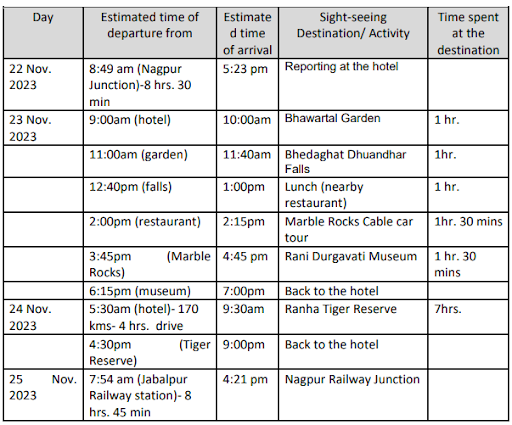
Analyse this itinerary to either approve or reject the tour proposal, while focusing on the students’ safety, interest, and physical wellness. Write this analytical paragraph in about 120 words, by selecting features that support your analysis.
You may begin like this : A thorough analysis of the itinerary provided by the tour organising vendor reveals that the tour proposal should be accepted / rejected.
You may end like this: Therefore, the tour proposal for the educational trip should be approved / rejected.
Ans. A thorough analysis of the itinerary provided by the tour organising vendor reveals that the tour proposal should be accepted / rejected.
The given itinerary displays the timings and the activities of the three nights and two days educational trip to Jabalpur and Kanha National Park. This trip is for the senior students only. Vandhya Pradesh is a good place for landscape and wildlife sightseeing. Considering that the Kanha National Park holds dangerous animals like tigers, it is a risky site for children. On the other hand, the senior students are suitable for such a trip. However, one staff complimentary with 15 students seems more suitable for the location. The insurance is too low. There is no mention of the dance party in the given time table. A 7 hour trip in the park can be too exhausting. Along with the bottled mineral water, some light refreshment should also be provided. Interestingly, the tour trip, despite its flaws, will be a fun and educational trip for the students.
Therefore, the tour proposal for the educational trip should be approved.
Q10.The given statistics display the spendings of the income of an average household in the UK. Display the important points in an analytical paragraph.
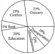
Ans. The given statistics display the spendings of an average household in the UK.
The spendings is divided into six categories – Clothes, Grocery, Rent, Transportation, Education and Miscellaneous. According to the given pie chart, an average UK household spends the majority of its income on groceries, which holds twenty-three percent of the pie chart. Next comes Education holding twenty percent of the pie chart, meaning that school fees in the UK are generally high. Rent holds the lowest fraction of the pie chart, which is just five percent, meaning that in the UK, rent is not as high as the price of groceries, basic commodities like food and water, and education. An average household in the UK is observed to spend eighteen percent of their income on miscellaneous items. In addition, no money is used for savings.
Therefore, an average household in the UK does not save money for future prospects.
Also See :
- 10 Examples of Letter to the Editor Class 10 and 12
- 10 Examples of Letter to Police Class 10
- 10 Examples of Letter to the Government Class 10
- 10 Examples of Informal Letter Class 10
- 10 Examples of Report Writing Class 12
- 10 Examples of Business Letter
- 10 Examples of Leave Application for Marriage Class 10
- 10 Examples of Story Writing Class 9
- 10 Examples of Speech Writing Class 11
- 10 Examples of Invitation and Reply Writing Class 12
- 10 Examples of Job Application with bio data Class 12
- 10 Examples of Complaint Letter
- 10 Examples of Article Writing Class 12
- 10 Examples of Notice Writing Class 12
- 10 Examples of Message Writing Class 6, 7, 8
- 10 Examples of Maternity Leave Application
- 10 Examples of Analytical Paragraph Class 10
- 10 Examples of Advertisement Writing Class 11
- 10 Examples of Letter to Principal
- 10 Examples of Leave Application Class 10
- 10 Examples of Debate Writing Class 11
- 10 Examples of Order Letter Class 10
- 10 Examples of Resignation Letter
Thank you SuccessCDs for the examples on Analytical Paragraph. These examples helped me understand the concept.
….
Thankyou for providing me this valuable information
Wowwwwww
superb
indrawat.devi9711@gmail.com
Very very Thanks You successCDs for the ex.on
Analytical paragraph
Thanks success CDs for making my students understand the concept
Study
Lalit
Very good analytical paragraph writing.
Good
Good
Good for practice, and I could get an idea of how to write one
thank you for the paragraphs.